Color Inspiration,  Inspiration,  Most Recent

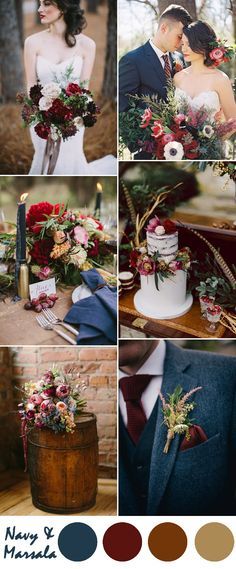
COLOR INSPIRATION: Burgundy/Marsala (Pantone Color of the Year 2015)

Pantone’s Color of the Year 2015 was Marsala, which I’m sure someone will say is different than burgundy, but I can’t see it. I do have to admit that when I saw that, I kind of had a moment to struggle with that choice. I’m a child of the 90s, and burgundy was all the rage when I was a teenager & in college. I had one of those dresses from Maurices in burgundy with the shoulder pads, the heavy fabric and the heart-shaped cut-out below the neckline with a little pearl dangling. I believe it was my husband’s brother’s first wedding (1995) that had burgundy as the main color. I guess I reflect on burgundy with the same conflict of emotion as I do when I see a teal suggestion, or the oh-so-popular-in-the-mid-2000’s black & red wedding (which was another husband’s brother’s wedding, in 2006). Funnily enough, when the first brother’s second wedding was held in 2009, their color was also red, and when my own brother was married in 2008, their color was black. Struggling to not have a moment again … What I would have given to have had a sister of my own to have some fun with color!

But don’t take my moment as a reason to have one yourself. The beautiful thing about colors and fuddy duddies like me is that we have a much broader ability now than we did 20 years ago to pair colors with variable neutrals and make them new again – and much, much more desirable. So with that in mind, I forced myself to pick up the study of burgundy and see what had evolved.

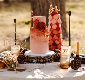
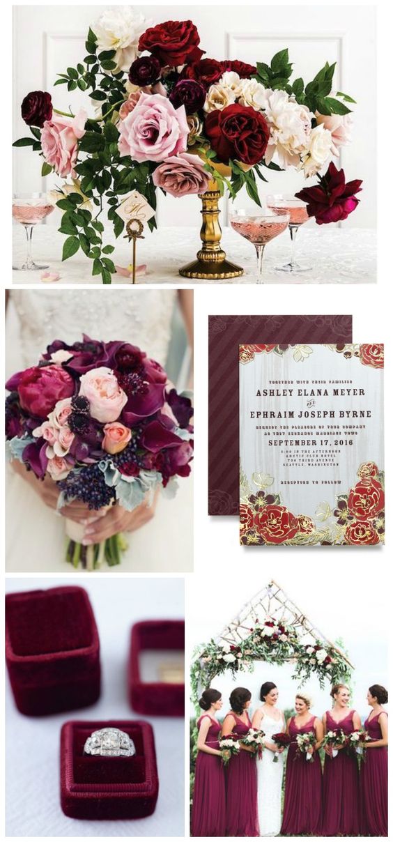
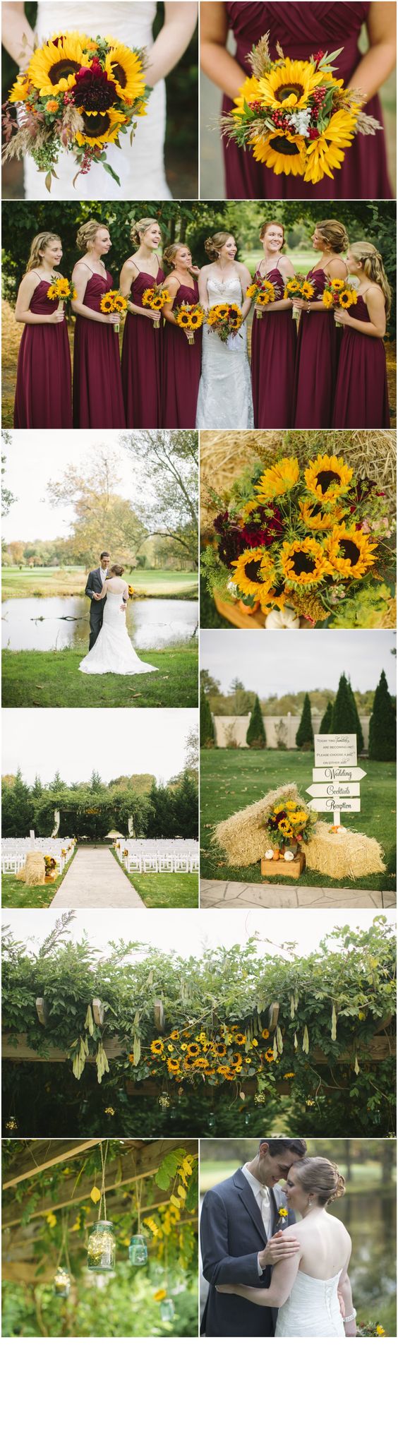
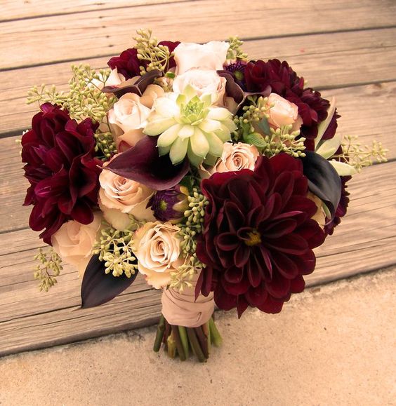
I was pleasantly surprised. Burgundy is being treated with the respect it deserves, yet the temperance it requires. Burgundy is a very color-rich jewel tone. It carries weight and, because of that, it screams ‘elegance’ – which I think is why it was seen as a perfect tone for formal gowns and weddings in the 90s. Weddings & elegance go hand-in-hand. But it can become too somber, *too* heavy, if one doesn’t pair it with some lighter colors. Enter today’s treatment of burgundy – and where it’s winning me over again … Scroll on, and click on the image for the website from whence it originated. (And thank God for Pinterest!)

Elegance personified with this heavy use of burgundy ... but I like the way their lightened it through their minty green greenery, repeated in the stationery, and the hints of light, light pink & purple.
Elegance personified with this heavy use of burgundy … but I like the way they lightened it through their minty green greenery, repeated in the stationery, and the hints of light, light pink & purple.
Now I LOVE this! Who would have thought the whimsy of sunflowers with the solemnness of burgundy?! It makes the effect light yet sophisticated, perfect for an outdoor wedding. Bravo on the choice of burgundy in the full tie on the gentlemen - the grey tux is a perfect major color player!
Now I LOVE this! Who would have thought the whimsy of sunflowers with the solemnness of burgundy?! It makes the effect light yet sophisticated, perfect for an outdoor wedding. Bravo on the choice of a grey tux to counterpoint the burgundy gowns!
This was a Pinterest find that clicked through to coukgarden.blogspot.sn but didn't really go anywhere. Again, though, the use of burgundy is lightened with pale pink and a little cream. I wish we had thought of this in the 90s!
This was a Pinterest find that clicked through to coukgarden.blogspot.sn but didn’t really go anywhere. Again, though, the use of burgundy is lightened with pale pink and a little cream. I wish we had thought of this in the 90s!
Now this is a fascinating combination, and would be smashing for a fall wedding! Navy and burgundy are both heavy colors, although navy is a beautiful neutral and really lends masculinity to the elegance of burgundy. The rich brown and greens are crucial to tie the two colors together ... the thing that I especially love, though, is how these colors combined make white just absolutely pop! The bride's gown, the groom's shirt and the white of the cake look crisp and fresh - what a way to make your whites really pop!
Now this is a fascinating combination, and would be smashing for a fall wedding! Navy and burgundy are both heavy colors, although navy is a beautiful neutral and really lends masculinity to the elegance of burgundy. The rich brown and greens are crucial to tie the two colors together … the thing that I especially love, though, is how these colors combined make white just absolutely pop! The bride’s gown, the groom’s shirt and the white of the cake look crisp and fresh – what a way to make your whites really pop!


Leave a Reply

Your email address will not be published. Required fields are marked *

AlphaOmega Captcha Classica  –  Enter Security Code